Version: Yurbi v11
Role: Builder or higher
Permission: Builder access to the application
A bar graph is best used in comparing values, highlighting distribution, ranking data, showing deviations, and comparing smaller data sets (as opposed to large quantities of data). It is a data visualization where data is displayed as horizontal bars going across the chart horizontally with the values axis being displayed on the bottom side of the chart.
A column graph is a type of graph is well-suited for showing comparisons over time, comparing different products or services, showing the distribution of data, and trend analysis. It is a data visualization where data is displayed as vertical bars going across the chart horizontally. The values axis being displayed on the left side of the chart.
Creating a chart visualization can either be through an existing report or when creating a new one.
When creating a bar or column chart it would need at least one character-based field and one numerical based field.
Accessing the Builder Section
This section shows the step on how you can access the builder section
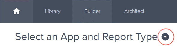
Once logged in, click Builder option at the top of your dashboard.

Creating the Report
This section shows the steps on how you can create your report
Select Application and Report Type
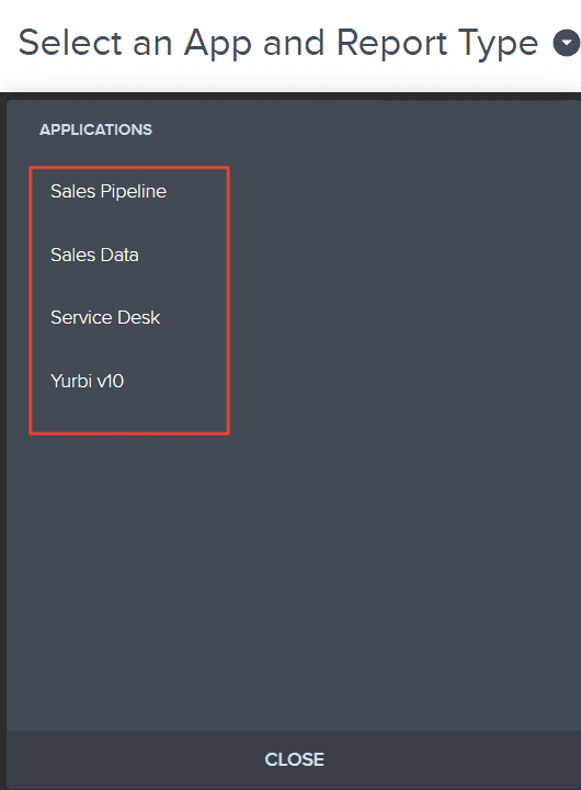
Click the down arrow next to Select an App and Report Type to open the dropdown menu.
Choose the application you wish to build a report for. The options are the applications you are authorized to modify.
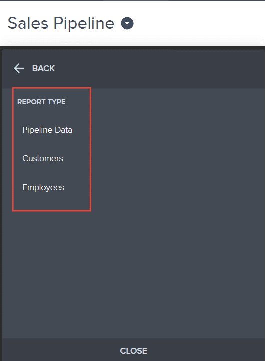
Now, pick the type of report you intend to create. Depending on the application, different report types will be available for your selection.
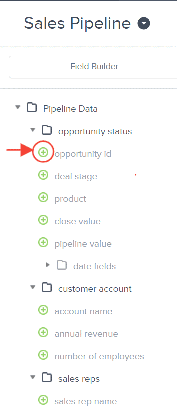
Building Your Report
This section shows the steps on how you can build from the report you created
With a report type selected, a report tree will appear. This contains all possible fields for your report.
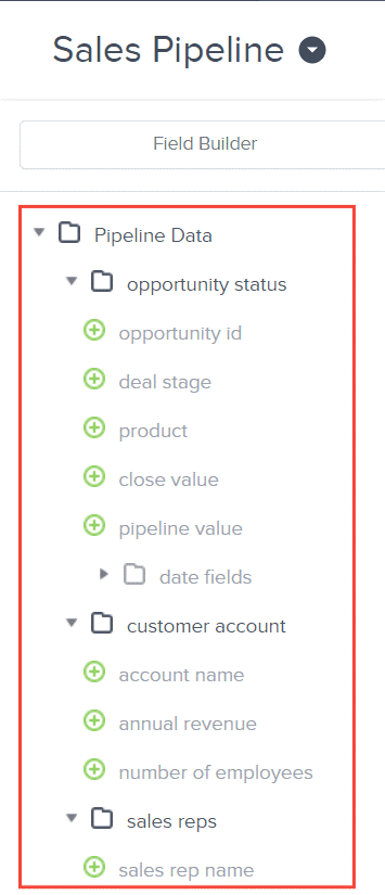
Click the plus icon (+) next to the fields you want to add. These will become the columns in your report and will be reflected in the preview area.
For more in depth process, here is an article on how to create a new data grid report from scratch.
Configuring Bar Chart Visualization
This section shows the steps on how you can configure the report you created into a bar chart
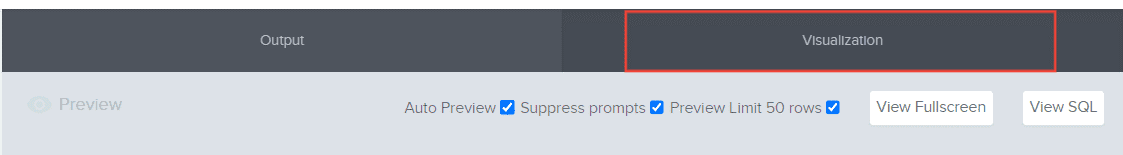
Once you have selected your report fields, Click Visualization
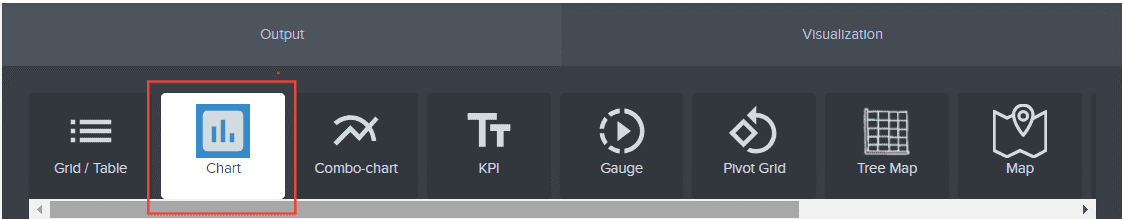
Select Chart
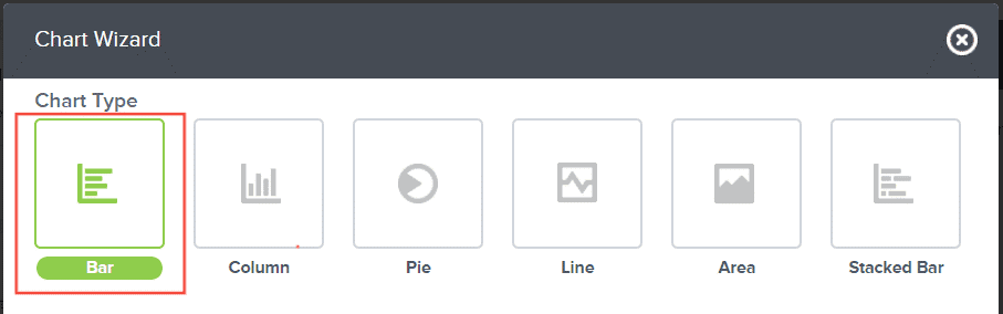
Choose Bar Chart Type
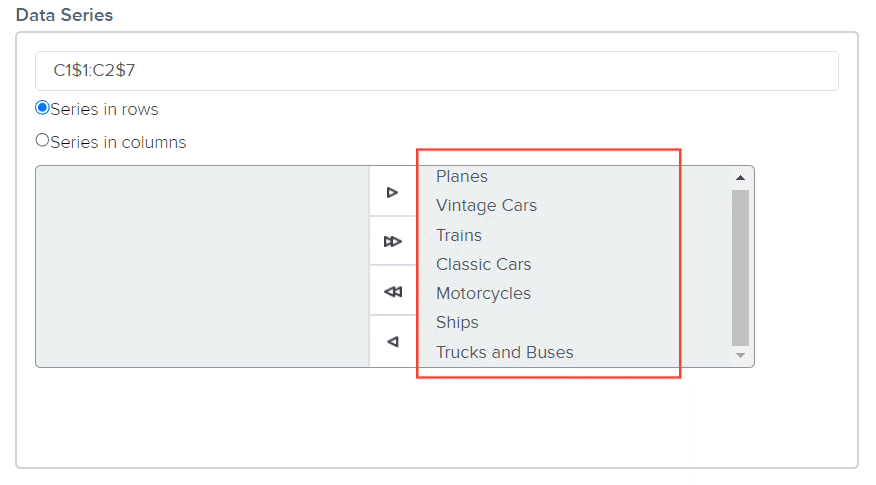
In your data series, the value of series in rows and series in columns will automatically populate in the right panel.
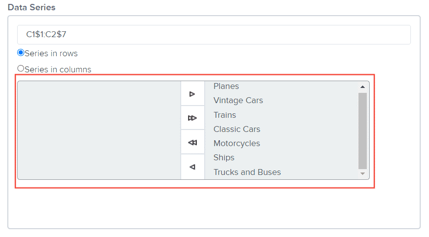
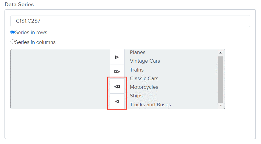
To remove one value from the right to the left panel, select the value.
Click on the left arrow for one value removal or double left arrow for bulk removal.
Type in Chart Title
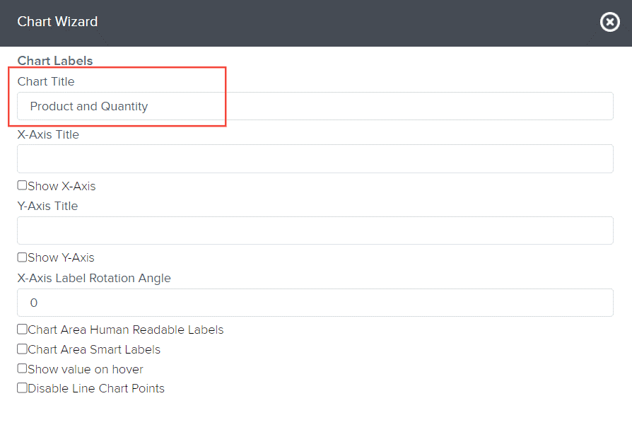
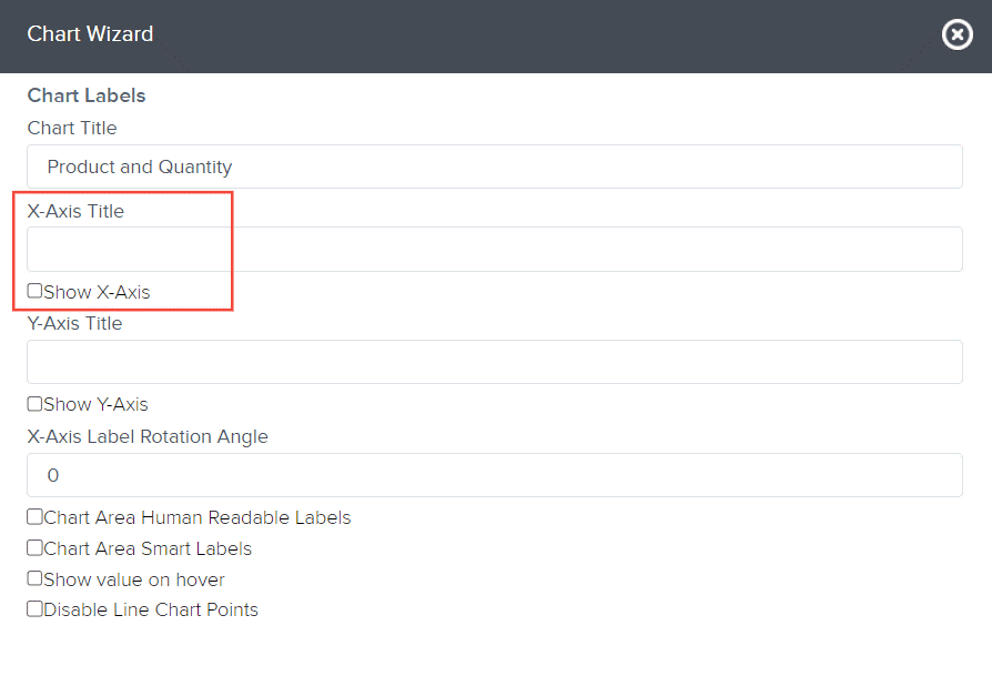
Type in X-Axis Title, and tick off Show X-Axis if desired. Ticking the checkbox makes the title show in your chart.
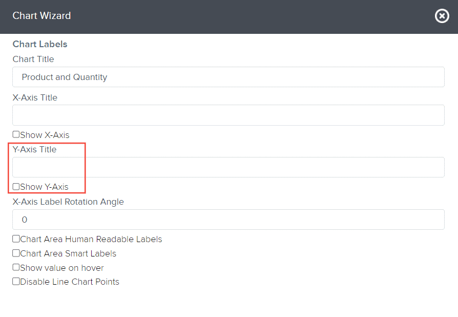
Type in Y-Axis Title, and tick off Show Y-Axis if desired. Ticking the checkbox makes the title show in your chart.
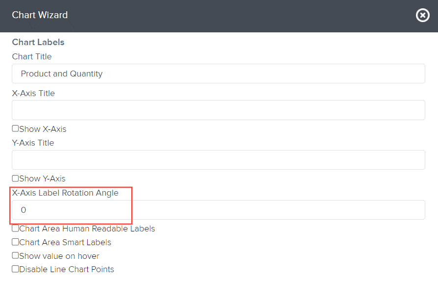
Type in the number for X-Axis Label Rotation Angle. This will make the X-axis label be arranged in an angle indicated here when you view the report.
Tick off the following checkbox if desired:
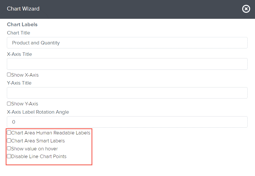
- Chart Area Human Readable Labels – shows the exact value of each bar in the chart
- Chart Area Smart Labels – leave this blank
- Show value on hover – when you hover on the bar/column part of the report, it will show you exactly the value of that bar/column.
- Disable Line Chart Points – applicable only in Line Charts. When this is ticked off, chart points won’t appear in the line chart.
Click Next

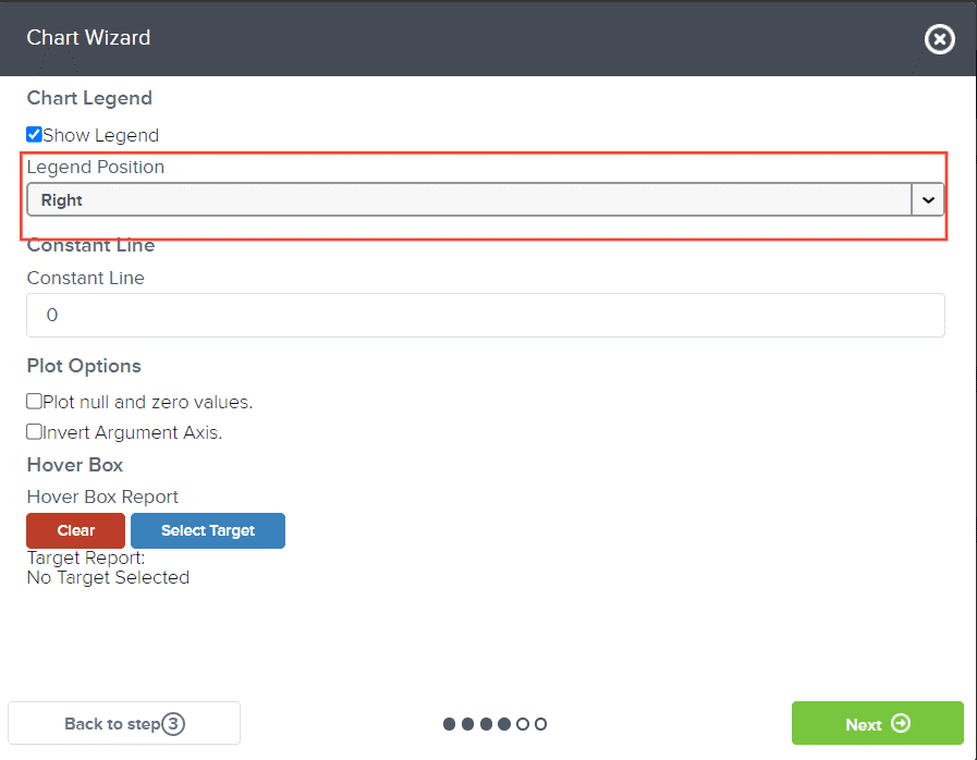
Tick Show Legend if you want the legend to show in the report
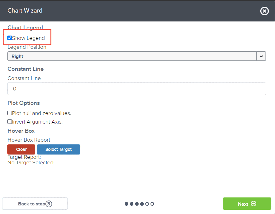
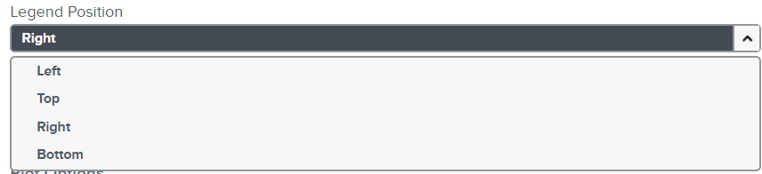
If you have ticked off Show Legend, choose the Legend Position from the drop-down menu. Leave the rest of the options unchecked and blank.
Click Next

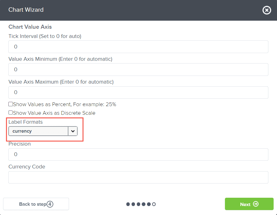
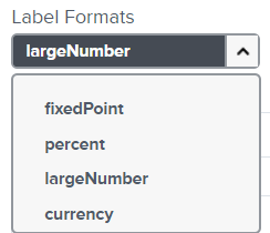
Choose your Label Format
Click Next

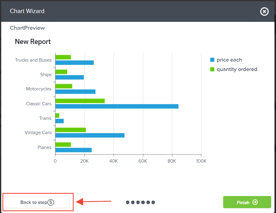
Preview the chart visualization you have configured. If you need to make changes from the previous steps, click back to step.
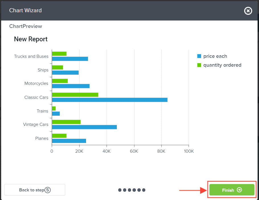
If not, Click Finish
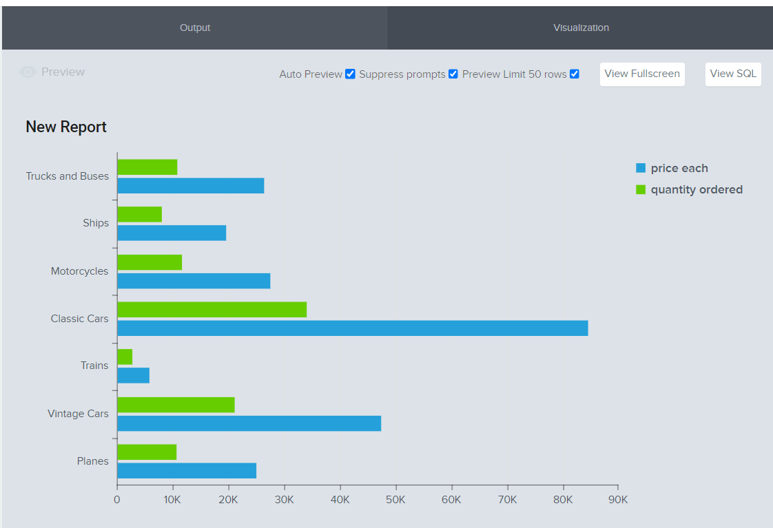
The chart visualization you have created will automatically reflect in the Preview section.
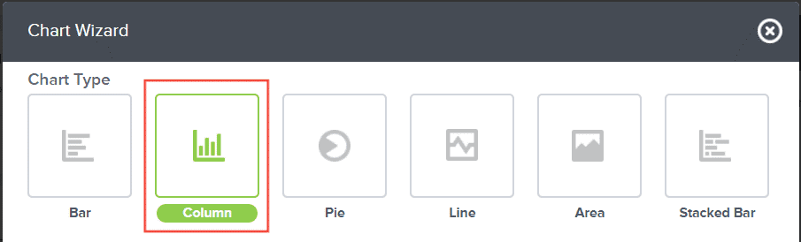
Configuring Column Chart Visualization
This section show the step on how you can configure the report you created into a column chart
When creating a column chart visualization, all you need to do is select Column as a Chart Type. The rest of the steps are the same as when you are creating a bar chart visualization.
And there you have it! You now know how to create a bar or column chart visualization!