One of the simplest and easiest ways to convey information is via a key performance indicator or (KPI).
To learn more about KPIs you can read here, but simply put, a KPI provides a single value which at a glance allows you to make a decision regarding some business process or business component.
Examples include thing such as:
- What are my sales?
- How many support tickets are active?
- How many widgets did we produce?
And as with any sort of reporting, combining those questions with date values and looking at them across various parameters and time frames can give you a quick look at the success or progress of your business.
- What are my sales this month compared to last?
- How many active support tickets for my VIP customers?
- How many widgets did we produce compared to what was ordered?
Different types of KPI Visualization Types (various use cases)
KPI Text – This is just the default KPI view, we refer to it as the “big number.” It’s simply a value displayed with a header (and an optional prefix or suffix text).

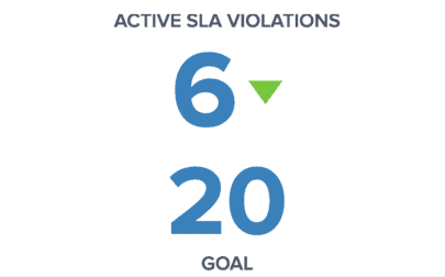
KPI Text w/ Goal – This method is perfect to compare a current KPI value against a past value or a budget value. And you have the ability to indicate visually via a caret symbol if the comparison is a positive or negative thing for that specific metric.
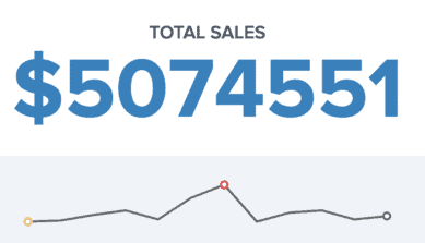
KPI Text w/ Sparkline – This method allows you to see the current KPI value and a trendline of how that value has fluctuated over time.
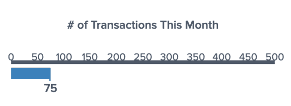
KPI Gauge – This is a linear gauge method of looking at the current KPI value against a static threshold. If you know the maximum value of a metric, this is a good option to show how far or close away you are from that target.
In Yurbi, as with all visualizations, producing a KPI starts with creating a proper dataset.
In the video below, we discuss the key elements of building that dataset and converting them into the 4 KPI types described above.
Summary of Best Practices
- Sort and hide data fields to ensure your desired KPI value is always in the row and column position assigned to your KPI. The KPI builder uses a fixed column and row value to display the KPI value. Ensure that your dataset is created to ensure the value you expect is always located in that column and row. This can be accomplished by hiding all field except for your value field, or applying criteria and sorting to ensure you always have the current month’s value in the first row, for example.
- When adding sort orders, criteria, or formulas to non-visible fields, ensure they do not alter the desired result of your KPI. While Yurbi allows you to add sort orders, criteria, and formulas on non-visible fields, in some database queries that will trigger values to be added to the resulting SQL query and affect results. Be sure adding items to non-visible fields produces the result you are expecting.
- Create drill-down target reports or trendline reports to use as sparklines first, as you will need to reference them when building the KPI report.
- Any values you want to be used as potential dashboard filters should be added as non-visible fields in your KPI report.
These tips and more are covered in the video below.